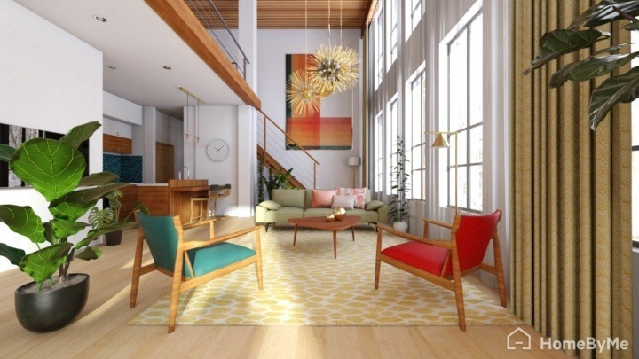
Learn how to personalize your designs by combining colors


Color matching has recently become a popular way of improving interior designs. There is something for everyone, and you can choose between flashy, powdered, sharps or pastels. Light and bright colors enable you to make a room seem more spacious while darker shades give it a sense of privacy. Neutral colors like beige or taupe create a soothing atmosphere.
On the contrary, strong colors like red, yellow or blue are bolder and add brightness to your decor. So what’s the best way to combine these colors without making mistakes? In other words, how can you find inner harmony within your home? There are four ways to combine colors.Using color radients which rely on a base color which is either very light or very dark. This gives a result which is both consistent and elegant. Contrasts enable you to apply two clear-cut colors for a more dynamic result. Monochromes are available in the same range of color. For example, you can combine different reds, oranges or pinks and this will result in a peaceful effect to your home decor. The last option is a chromatic scale that guides you in mixing colors like blue, pink and mauve.

Modern living room with touches of blue, red and yellow.
Having a ceiling which is a darker color than the rest of the walls will make the ceiling seem lower than it is. It’s a great way to reduce the overall floor-ceiling space when the ceiling is too high. On the contrary, a lighter shade on the ceiling will give a sense of space to the room.
Doors or windows harmoniously blend into the background if they are the same color as neighboring walls. On the contrary, you can be brave to use sharp shades for doors and windowns which will add a dynamic and modern touch to your room.
In a narrow room, you should always apply a dark color to the back wall in order to give the room a sense of lighting and space. A bright paint is also a great way to give more perspective to a room. Logically, a wall at the back of the room, which is lighter than the three others, will make the space seem smaller and warm up the atmosphere.
When painting the ceiling with the same color as the back wall, as mentioned in the previous example, you’ll emphasize the intended effect. For example, a bedroom with a ceiling and back walls which are decorated with a dark shade will seem larger and make the ceiling appear lower.
We love using two colors in stripes on the same wall. To master the effect of this combination, always remember that a dark-colored lower strip will enhance the ceiling’s height. On the contrary, a light-colored strip will give the impression of a high ceiling.